

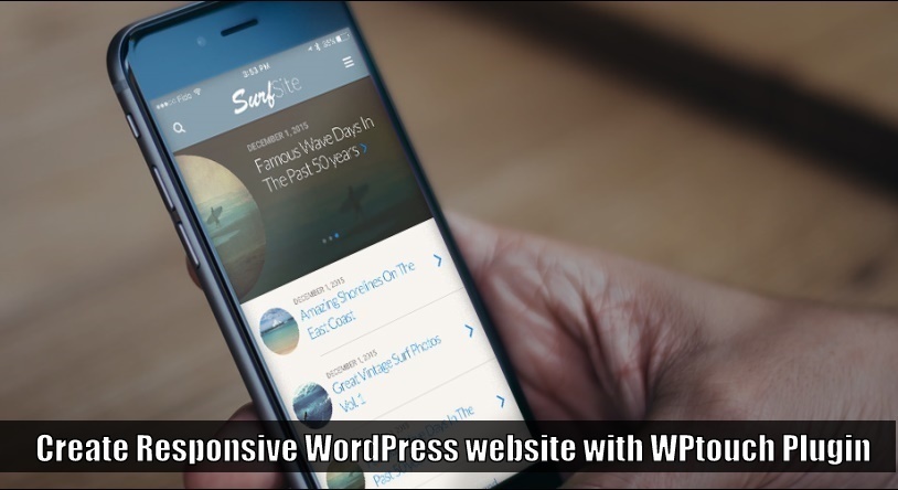

What Is Mobile Friendly Websites?
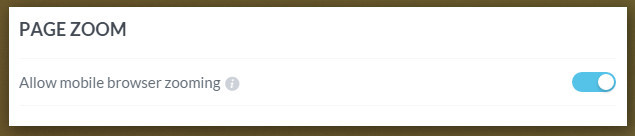
This question is asked by many new WordPress designer or new website owners.Mobile friendly layout(Responsive layout) increases the chances of getting more visitors from mobile devices because they’ll get a good experience of the responsive website in any device and mobile friendly website also load fast so users can browse a website with slow internet.Mobile friendly website are also important for Seo of a website because google and bing rolled out an update in which consider that only mobile friendly website will get mobile traffic and that is why it is recommended to create every website responsive. Mobile friendly website are also important for Seo of a website because google and bing rolled out an update in which consider that only mobile friendly website will get mobile traffic and that is why it is recommended to create every website responsive.
How to Setup WPTouch WordPress Plugin
Before beginning to configure WPtouch WordPress plugin, you have to install the WPtouch plugin from WordPress dashboard.Installing WPtouch is same as installing a plugin.After you install the WPtouch plugin, you’ll find the WPtouch plugin dashboard link in the left menu panel on WP dashboard.By clicking on the link, you’ll make changes to the WPTouch plugin. After you install the WPtouch plugin, you’ll find the WPtouch plugin dashboard link in the left menu panel on WP dashboard.By clicking the link, you’ll make changes to the WPTouch plugin.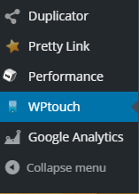
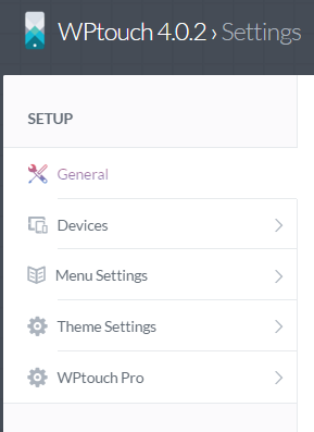


Step 1.Configure General Settings
The first step is to configure general settings which included many basic but essential setting options. 1.1.MOBILE SITE TITLE – Enter your website or blog title in the box so visitors can see the name or title of your website. For example – “How to plugin”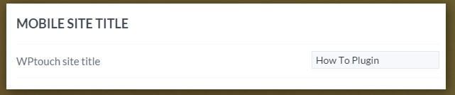


Step 2.Select Mobile Device
The Second step is to choose the mobile device and browser for you want to enable the WPtouch mobile layout. 2.1.MOBILE DEVICES & BROWSERS – In this option, you can select the browser and IOS based phones on where you want to enable the default website layout.I recommend you to enable all browsers and devices so all mobile users will get the same and good experience of your mobile friendly layout.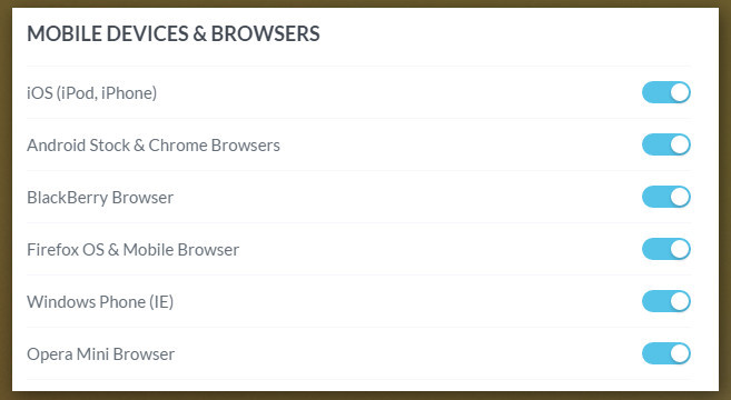

Step 3.Menu Settings
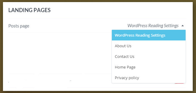
The third and very important step is setup up the menu navigation.It helps visitors to navigate your website easily. 3.1.MENU SETUP – In this option you have to select the navigation bar which will show in the mobile layout of your website as the default menu bar.First create a special navigation bar in that case when you want to show any different link to mobile users, then save the menu and select the menu location from the below of the menu. Menu Generating link – yourdomain.com/wp-admin/nav-menus.php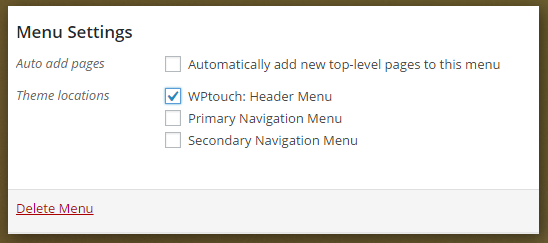

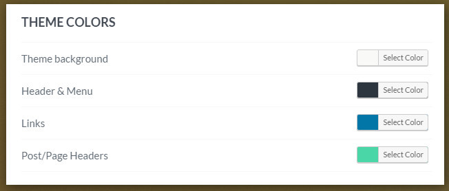
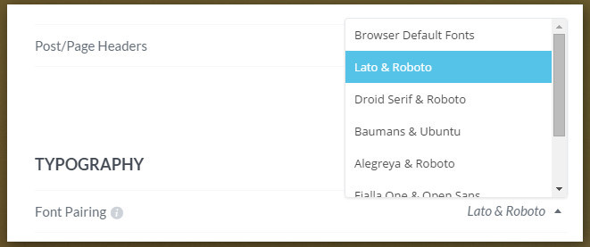
Step 4.Theme Settings
Fourth step is to configure the theme in which included that how you site will looking, like site logo, color, and typography etc. 4.1.HEADER – In this option, you can select the logo of your website which will show in the header section of your blog.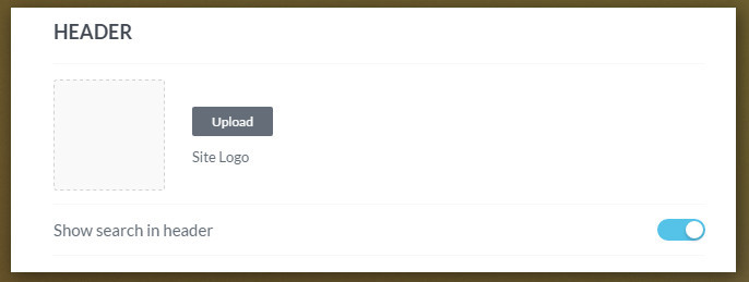


The second method
Second method is very easy you just have to buy a responsive WordPress theme from the ThemeForest, after installation and setting up premium responsive theme your website starts looking great also in mobile and other devices, but the second method will completely change your existing website layout and you have to choose the perfect WP theme for your website. Direct Link of Themeforest WordPress templates
Final Words
You just read a tutorial on how to create a responsive WordPress website or we can say that how to setup WPtouch WordPress plugin.I consider two different methods of creating a mobile friendly website and both methods are unique and great.If you want to create If you want to create a mobile friendly design without loosing your existing website layout then you should follow the first method, but if changing existing layout of your website is not affect your website then you can follow the second method.
About Post Author

